The Brief
Take a number of shots using lines to create a sense of depth. Shooting with a wide-angle lens (zooming in and out) strengthens a diagonal line by giving it more length within the frame. The effect is dramatically accentuated if you choose a viewpoint close to the line.
This exercise is divided into two parts, the first being the use of leading lines to create depth and the second being the counter to this; using the lines to remove depth and create an abstract photograph.
Part 1
For Part 1, the works of Eugene Atget are referred to as examples of using lines in make the photograph three dimensional. At first glance, his ‘documents pour artistes’, shot in Paris in the early part of the 20th Century, we see a seemingly ordinary set of documentary images. Atget had indeed set out to simply document the changing face of Paris through its architecture. Unlike the street photographers that followed him, Atget used people and way of life to supplement his commentary on Paris rather than how the city had influenced its people. What he developed during this exploration of his home, was a style of photography that makes the viewer forget that this is a flat, two-dimensional image. He influenced a great many photographers posthumously, but none more than Berenice Abbott. She discovered his work fairly late in his life and went about purchasing as many negatives as possible. After his death, Abbott published much of Atget’s work, establishing him firmly in the photography greats. While interesting enough, it’s the influence on Abbott that appeals to me as I became familiar with her work a few years ago when we purchased a print of her 1932 photograph ‘Oyster Houses, South Street and Pike Slip’, shown below. She had met Atget through Man Ray, whom she was working for as an assistant at the time. Her photography was itself in its infancy, so it should be of little surprise that Atget’s work should be such an influence on her.
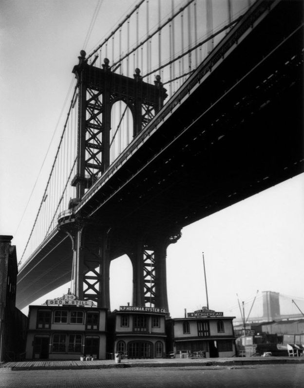
Oyster Houses, South Street and Pike Slip 1931-32, Berenice Abbott [1]


Abbott was a great technical photographer and later became a teacher at the New School for Social Research [1]. Although she taught photography, she combined her experience of surrealism gained with photographers such as Man Ray, with an interest in the sciences. She photographed a number of physics phenomena after leaving the school, most notable being the tracing of light rays. Some of these images link directly to the Part 2 of this exercise.
My approach
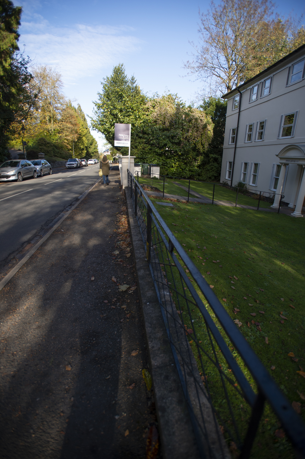
The three things I wanted to explore with leading lines were the effects of focal length, aperture and crop on the sense of depth created. I already appreciated the difference that focal length can have on perspective as I’ve shot many landscapes in my time as a photographer. Short focal length lenses offer wide angles, long distances between near and far subjects, but introduce distortion depending on the angle that the lens is to the subject. It’s particularly noticeable at short distances on vertical lines, such as tall buildings. Perspective distortion can be an interesting effect but can be a problem if the intent is to create something that maintains a sense of reality about it. Long focal lengths, by contrast have the effect of shortening the perceived distance between near and far objects but give little sense of depth or distortion. Larger apertures offer the ability to pick out a subject by intensifying the out-of-focus regions, dependent on the focal length and relative distances of between subjects and the background. Smaller apertures have the inverse effect. Add the crop ratio of the image, do these factors change the way the depth or scale of the image appears when leading lines are involved?
Reviewing the images by Berenice Abbott, the effect of the out of focus areas in the image accentuate the sense of depth, particularly in the Manhattan Bridge image. The final aspect is crop. Does a tighter crop impact the effect caused by the combination of the other techniques?
My images
-
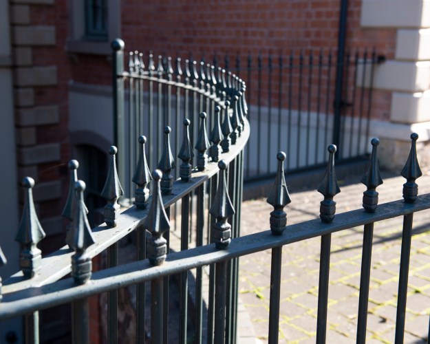
- Photo 1 – focal length of 48mm

-
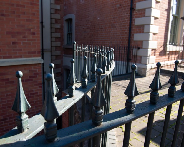
- Photo 2 – focal length of 24mm
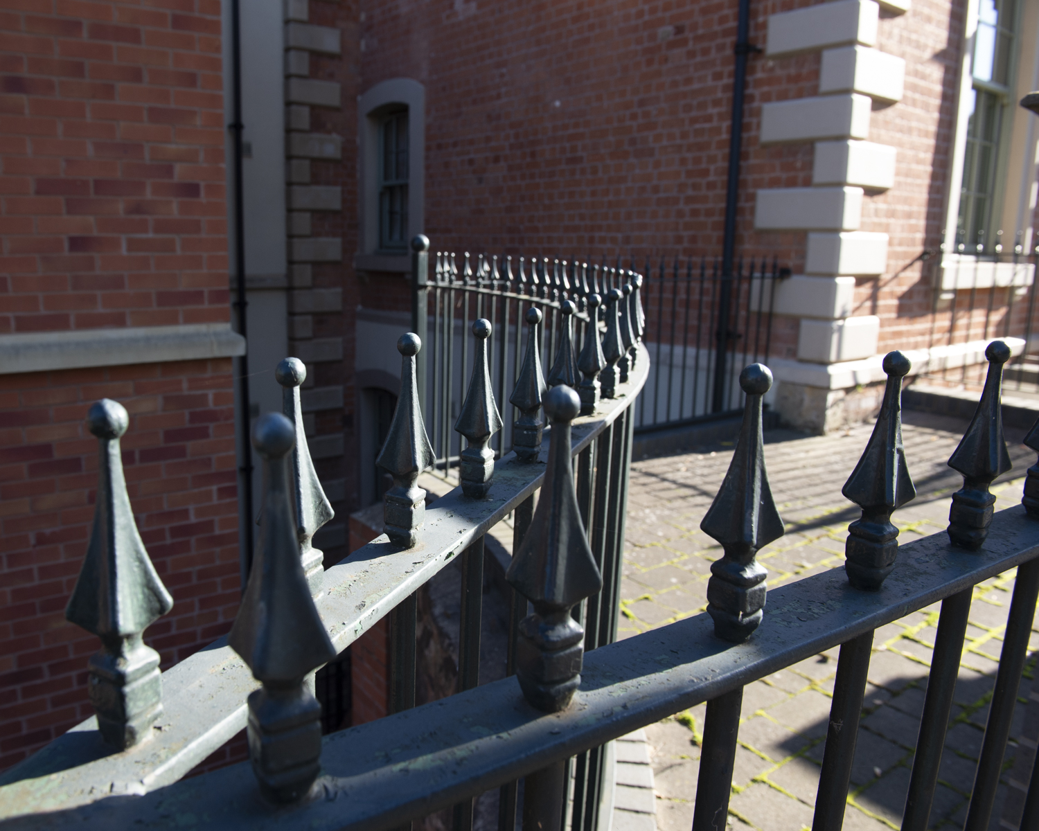
In the above shots, the end of the railing appears closer to the viewer in Photo 1 than Photo 2. The shots are not taken from precisely the same position but the curvature of the rail as it leads into the photographs have very different perspectives.
-
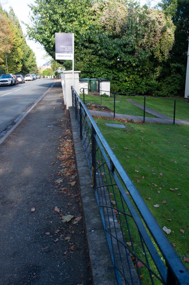
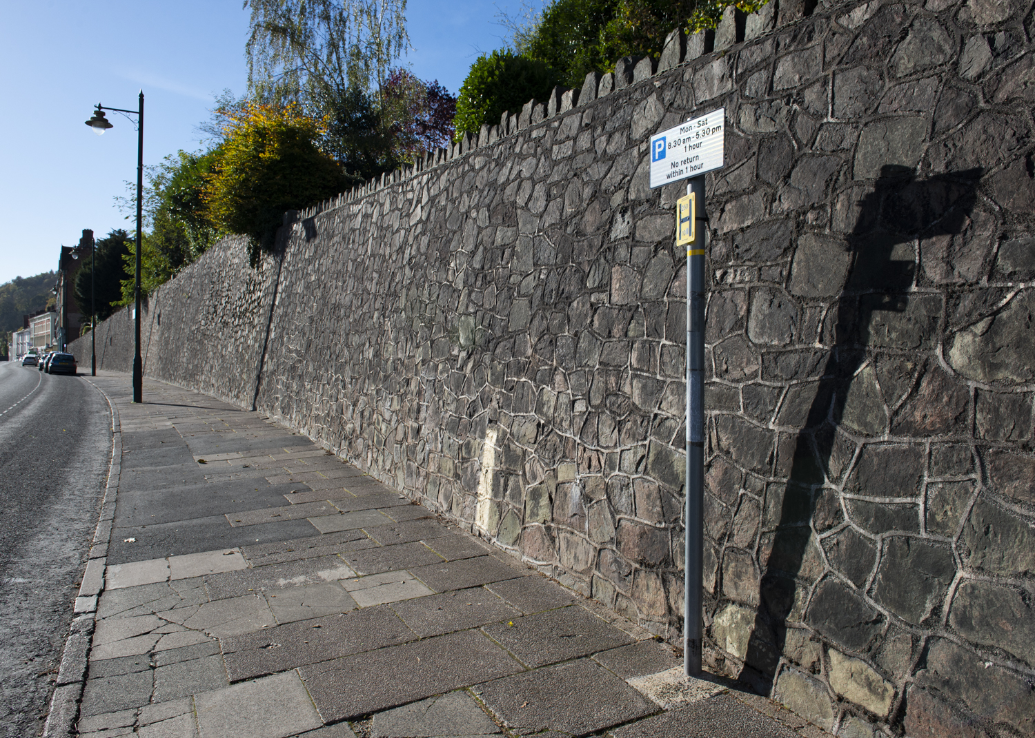
- Photo 3 – 35mm, 1/125th at f8

-
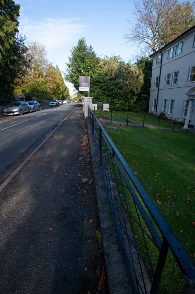
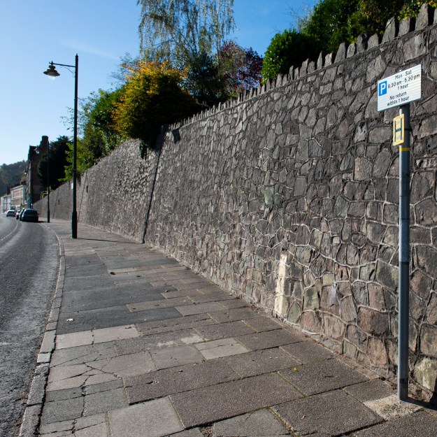
- Photo 4 – 17mm, 1/250th at f8
In the photographs above, the difference is again very noticeable. In the case of Photo 4, the very wide angle lens at 17mm creates a sense of the For Sale sign being much further away than in Photo 3. The inclusion of the building and parked cars owing to the increased field of view, adds to the depth of the image.
-
- Photo 4 – 17mm, 1/250th at f8
-

- Photo 5 – 17mm, 1/2500th at f2.8
Now with the addition of increased aperture from f8 to f2.8 (the focal point still being the signpost), the negligible difference between the far-field, out-of-focus elements in Photos 4 and 5 is barely noticeable. The same cannot be said for the near-field, where the railing is more blurred in Photo 5. We’d expect this for such a short focal length, but what it also shows is no discernible difference in the sense of depth of the photograph. Note: Photo 5 is a slightly different composition and exposure as I had to move out of the way of the lady who walked past. This doesn’t change the point being made, however. Reviewing Abbott’s Manhattan Bridge photograph again, the effect that makes the difference is actually more likely haze from pollution in the city. It certainly adds to the drama of the image.
The final element I wanted to look into was the effect of cropping. Photos 6 and 7 are the same shot, cropped differently, 5×7 and 1×1 (Square) respectively.
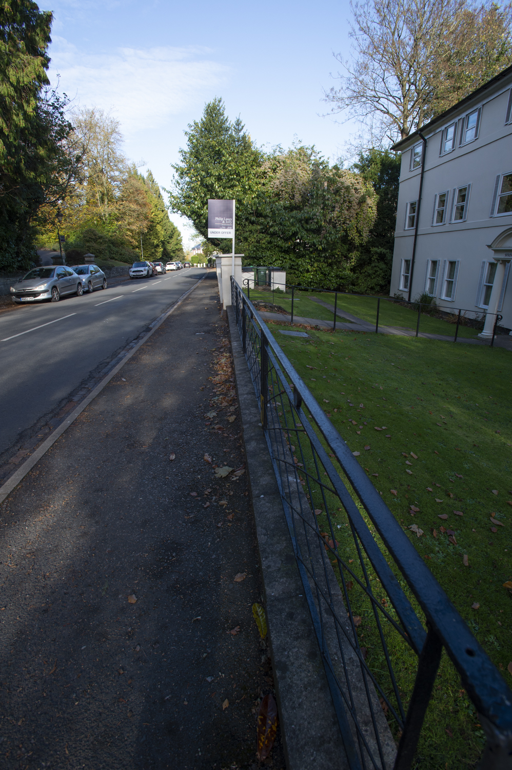
-

- Photo 6 – cropped 5×7
-
- Photo 7 – cropped 1×1
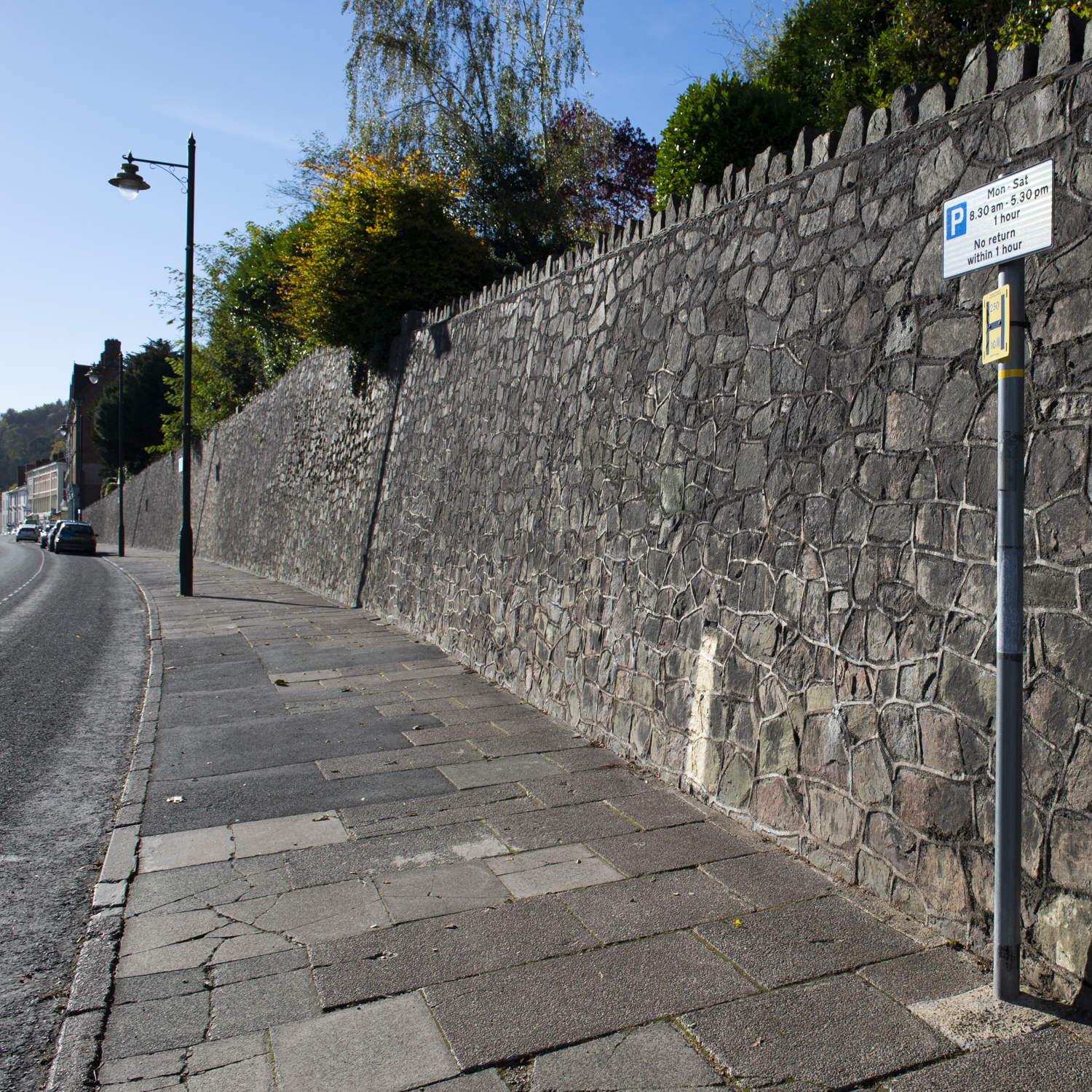
Naturally, cropping changes the composition and arguably, the square now doesn’t work as the signpost is too close to the right-hand edge. However, the depth of the image doesn’t really change. What I conclude from this is that as long as the line suits the composition, in this case leading the eye along the Malvern stone wall to the edge of the town, the same approach applies regardless of the crop.
Other Leading Line Images
I took many photographs during this exercise, with a few of them shown below.


Review
Photo 8
The lines on the road are as clear direction as the eye needs, but the building also adds it’s own depth, broken only by the cafe sign.
Photo 9
This stairway alongside a hotel in town tracks the contour of the hillside. I tried to trick the eye with a distorted railing in the near-field, but the overwhelming leading line is seemingly unbroken as it leads away.
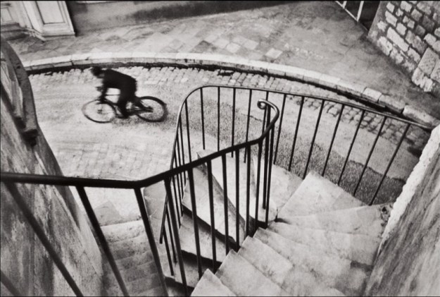
Photo 10
Inspired by Cartier-Bresson’s Hyeres, France, 1932, that I used in Exercise 1.2, this shot of the staircase demonstrates depth in following the line towards the figure at the bottom of the stairs. It was captured quickly, which didn’t give the opportunity to remove the leaf from the steps, which unfortunately acts as a distraction.
Part 2
Now take a number of shots using lines to flatten the pictorial space. To avoid the effects of perspective, the sensor/film plane should be parallel to the subject and you may like to try a high viewpoint (i.e. looking down). Modern architecture offers strong lines and dynamic diagonals, and zooming in can help to create simpler, more abstract compositions.
Research
Having looked at the concepts of leading the eye around the photograph as a pleasurable experience, this part of the exercise pushes the viewer to suspend their immediate assumptions about the subject matter. The brief material mentions Bauhaus, a design school in Germany that was open throughout the 1920s and closed in 1933 with the rise of the Nazi party. Bauhaus was intended to bring the two seemingly different fields together, applied art and manufacturing [2]. At first glance, it would be difficult to see a direct link between them. However the guiding principles about simplicity in design, that is the removal of the extraneous, leaving something that doesn’t overcomplicate when viewed, yet appreciated for its execution. In manufacturing, a product is easier, more cost effective to produce if the design is simple to begin with. Bauhaus artists produced modern designs for furniture that minimised both the aesthetic qualities of the finished article, but reduced the production to only the material and assembly the was more important. An example of this is their famous use of tubular metal in a, now common, office chair design (below). This simplicity in turn gave the artists more scope for experimentation with materials that had fewer considerations when incorporated into a product, for example the fixing of the covers of the chair being incorporated as ties in the covers themselves.
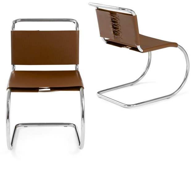
The Mies van der Rohe office chair (courtesy of dezeen.com)[2]
My Abstract Lines
In shooting my abstract lines, I changed direction from the guidance in the brief. One of my favourite forms of photography where unusual forms appear in seemingly mundane subjects is ‘macro’. Instead of looking for distant subjects, I opted instead for very close up with my Nikon 200mm f/4 macro lens.


Review
Abstract 1
With the idea of ‘similar, but not identical’, I made this photograph by taping two pieces of 35mm film to my phone screen The black and white film was overlaid on the colour and its sprocket holes deliberately mis-aligned to achieve the asymmetry. The text along the edge helps explain what the subject is. I like this photograph, because the viewer is looking along the off-horizontal lines that lead to the edges of the frame, but can quickly establish what the subject is by reading the text.
Abstract 2
When I was growing up, barcodes seemed new and hi-tech. The lines in this frame lead nowhere and intersect the numerical code that runs vertically in the photograph. Again, the eye has no direction around the photograph, and similarly while the subject is recognisable, what does the code mean? I lit this with a green gel to convey the classical view of modern computing, the green displays of my childhood.
Abstract 3
I tested this photograph on my friends and colleagues. Those old enough to be familiar with vinyl records instantly recognised it as an album track. Interestingly, while the grooves lead nowhere, the colour fringes that were caused by the angle of the LED light to the lens and the surface resulted in a less uncomfortable image to look at. I put this down to the softness of the light and interesting colours. In comparison, when the image is converted to black & white, the image becomes harder on the eye as shown below.

Abstract 4
This shot of a rendered wall in Malvern was made in bright sunlight with a 50mm lens. The lines of the plasterwork are both complimented and a contrasted with the shadow. While I was trying to create the flat abstract effect, the shadow reveals the 3D nature of the wall. In addition, the remains of the spider’s web in the centre distracts from the lines in the frame. I like this photograph but it doesn’t demonstrate the effect that I was after. However, this does highlight the subtlety of how light affects a composition.
Further Reading and Reflection
‘forces a concentration on the picture edge…and on the shapes that are created by it’.
The section of The Photographer’s Eye [3] that this quote comes from ties together the challenge of frame that a photographer has over a classical painter. The notion that photographers were driven to fill the frame with as much of the desired detail as possible for economic reasons, seems an old-fashioned principle in today’s digital age. However, I can identify with that sentiment as someone who has re-discovered film photography. If I were to create an analog print without an enlarger, the physical cropping and wasting of paper wouldn’t occur to me. While I shoot film, my post process workflow is entirely digital, from scanning, to dust removal to printing. In reality, I am still very much a digital photographer which has allowed me to be less mindful on where the edges of the frame are. For this reason I will use the crop after the fact. A good example in the previous exercise is the spider’s spinneret. I wanted the subject in the frame with it’s web, understood that the relationship between them could be placed on the frame thirds, but was happy to shoot many and crop what worked. I think that the combination of using a manually-focussed macro lens and the speed which which the spider was moving around, meant that this approach would yield a successful image and I am happy with how the photograph ended up…but I didn’t consider the rest of the composition.
In his book Taking My Time [4], Meyerowitz explains the virtue of being able to look beyond the frame for the anything that looks like it may form some relationship with your subject, surmising that our vision is so wide in all directions that if we concentrate entirely on the small viewfinder window of a camera, we could miss the greater narrative of a picture we think we understand. He exalts the use of his rangefinder camera with the frame effectively being composed at one edge of the camera (as opposed to the central position of a conventional SLR). By using both eyes, one to frame the photo and one to look past the camera at the scene, Meyerowitz describes looking for a magnetism between what’s in and currently out. What is out, might just enter the frame and, better still change the meaning behind the photograph. What I have learned from both books is to increase my awareness from the basic rules of photographic composition, which I believe I knew to some extent, to making better use of the frame.
References
[1] “Berenice Abbott’, Beetles & Huxley Catalogue, 2015
[2] “Dezeen’s Guide to Bauhaus Design”, Owen Hopkins, Web Article https://www.dezeen.com/2018/11/01/bauhaus-100-guide-architecture-design/, 2018
[3] “An Introduction – The Photographer’s Eye”, John Szarkowski, MoMA, 2007
[4] “Taking My Time”, Joel Meyerowitz, 2012